For inserting a responsive <img> element in your template, use the get_image function or the image API endpoint with the available parameters.
PHP
ResponsivePics::get_image(id, sizes, crop, classes, lazyload, lqip, decorative);
REST API
GET /wp-json/responsive-pics/v1/image/<id>?sizes=<sizes>&crop=<crop>&classes=<classes>&lazyload=<lazyload>&lqip=<lqip>&decorative=<decorative>
Image Parameters
| Parameter | Type | Required | Default | Definition |
|---|---|---|---|---|
| id | number | yes | The WordPress image id (e.g. 1). |
|
| sizes | string | yes | A comma-separated string of preferred image sizes (e.g. 'xs-12, sm-6, md-4, lg-3'). See the Sizes section for more information. |
|
| crop | number / string | optional | false |
A crop-factor of the width for the desired height within the default range of 0-2 (e.g. 0.75) with (optional) crop positions (e.g. 0.75|c t). See the Cropping section for more information. |
| classes | string | optional | null |
A comma-separated string of additional CSS classes you want to add to the image element (e.g. 'my_img_class' or 'my_img_class, my_second_img_class'). |
| lazyload | boolean | optional | false |
When true enables lazyload classes and data-srcset attributes. See the Lazyloading section for more information. |
| lqip | boolean | optional | false |
When true enables LQIP classes and src attribute. See the LQIP section for more information. |
| decorative | boolean | optional | false |
When true the image will be treated as a decorative image and an empty alt attribute will be added. |
For retrieving the responsive <img> data in your theme, use the get_image_data function or the image-data API endpoint with the available parameters.
PHP
ResponsivePics::get_image_data(id, sizes, crop, classes, lazyload, lqip, decorative);
REST API
GET /wp-json/responsive-pics/v1/image-data/<id>?sizes=<sizes>&crop=<crop>&classes=<classes>&lazyload=<lazyload>&lqip=<lqip>&decorative=<decorative>
This will return an array containing the available image sources per breakpoint, alt text, mime-type, boolean values for alpha channel, lazyload and decorative, an url for the lqip image and an array for the css classes:
[
  'alpha'      => (bool)   $alpha,
  'alt'        => (string) $alt,
  'classes'    => (array)  $classes,
  'decorative' => (bool)   $decorative,
  'lazyload'   => (bool)   $lazyload,
  'lqip'       => (string) $lqip,
  'mimetype'   => (string) $mime_type,
  'sources'    => (array)  $sources
];
This will enable you to construct your responsive <img> element yourself with the available data.
For inserting a responsive <picture> element in your template, use the get_picture function or the get-picture API endpoint with the available parameters.
PHP
ResponsivePics::get_picture(id, sizes, classes, lazyload, intrinsic, img_classes);
REST API
GET /wp-json/responsive-pics/v1/get-picture/<id>?sizes=<sizes>&classes=<classes>&lazyload=<lazyload>&intrinsic=<intrinsic>&img_classes=<img_classes>
Picture Parameters
| Parameter | Type | Required | Default | Definition |
|---|---|---|---|---|
| id | number | yes | The WordPress image id (e.g. 1). |
|
| sizes | string | yes | A comma-separated string of preferred image sizes (e.g. 'xs-12, sm-6, md-4, lg-3'). See the Sizes section for more information. |
|
| classes | string / array | optional | null |
A comma-separated string or array of additional CSS classes you want to add to the picture element (e.g. 'my_picture_class' or 'my_picture_class, my_second_picture_class'). |
| lazyload | boolean | optional | false |
When true enables lazyload classes and data-srcset attributes. See the Lazyloading section for more information. |
| intrinsic | boolean | optional | false |
When true enables intrinsic classes and data-aspectratio attributes. See the Intrinsic Aspectratio section for more information. |
| img_classes | string / array | optional | null |
A comma-separated string or array of additional CSS classes you want to add to the picture’s img element (e.g. 'my_image_class' or 'my_image_class, my_second_image_class'). |
For retrieving the responsive <picture> data in your theme, use the get_picture_data function or the picture-data API endpoint with the available parameters.
PHP
ResponsivePics::get_picture_data(id, sizes, classes, lazyload, intrinsic, img_classes);
REST API
GET /wp-json/responsive-pics/v1/picture-data/<id>?sizes=<sizes>&classes=<classes>&lazyload=<lazyload>&intrinsic=<intrinsic>&img_classes=<img_classes>
This will return an array containing the available picture sources per breakpoint, alt text, mime-type, boolean values for alpha channel, animated, lazyload and intrinsic, an array for the picture css classes and an array for the img css classes:
[
  'alpha'           => (bool)   $alpha,
  'alt'             => (string) $alt,
  'animated'        => (bool)   $animated,
  'mimetype'        => (string) $mime_type,
  'sources'         => (array)  $sources,
  'lazyload'        => (bool)   $lazyload,
  'intrinsic'       => (bool)   $intrinsic,
  'picture_classes' => (array)  $picture_classes,
  'image_classes'   => (array)  $image_classes
];
This will enable you to construct your responsive <picture> element yourself with the available data.
For inserting a responsive background image in your template, use the get_background function or the background API endpoint with the available parameters.
PHP
ResponsivePics::get_background(id, sizes, classes);
REST API
GET /wp-json/responsive-pics/v1/background/<id>?sizes=<sizes>&classes=<classes>
Background Parameters
| Parameter | Type | Required | Default | Definition |
|---|---|---|---|---|
| id | number | yes | The WordPress image id (e.g. 1). |
|
| sizes | string | yes | A comma-separated string of preferred image sizes (e.g. 'xs-12, sm-6, md-4, lg-3'). |
|
| classes | string | optional | null |
A comma-separated string of additional CSS classes you want to add to the background element (e.g. 'my_bg_class' or 'my_bg_class, my_second_bg_class'). |
For retrieving the responsive background image data in your theme, use the get_background_data function or the background-data API endpoint with the available parameters.
PHP
ResponsivePics::get_background_data(id, sizes, classes);
REST API
GET /wp-json/responsive-pics/v1/background-data/<id>?sizes=<sizes>&classes=<classes>
This will return an array containing the available background image sources per breakpoint, alt text, mime-type, a boolean value for alpha channel, an id for the background element and an array for the background css classes:
[
  'sources'  => (array)  $sources,
  'alt'      => (string) $alt,
  'mimetype' => (string) $mime_type,
  'alpha'    => (bool)   $alpha,
  'id'       => (string) $id,
  'classes'  => (array)  $classes
];
This will enable you to construct your responsive background image element yourself with the available data.
The following image file formats are supported:
| File format | MIME Type | Properties |
|---|---|---|
| jp(e)g | image/jpeg | |
| webp | image/webp | Requires WordPress version 5.8 or higher |
| png | image/png | When the png contains an alpha channel, an extra 'has-alpha' class will be added to the picture image element for additional styling. |
| gif | image/gif | When the gif is animated (it will check for multiple header frames), no image resizing or cropping will be done to prevent discarding the animation. |
Any other image formats, will not be resizes or cropped.
The following syntax is available for each image size in the sizes parameter:
breakpoint:width
| Parameter | Type | Required | Default | Definition |
|---|---|---|---|---|
| breakpoint | number or string | yes | If undefined, and width is a number, breakpoint will be the same as the width. If undefined, and width is a column definition, breakpoint will be the corresponding breakpoint (e.g. if width is 'xs-8', breakpoint will be 'xs'). |
|
| width | number or string | yes | A column definition is a key in $grid_widths plus a dash and a column span number (e.g. 'xs-8'). If column span number is full, the full width of the next matching $breakpoint is used (e.g. 'xs-full') |
Since the <picture> element and background images support art directed images, the following full syntax is available for each image size in the sizes parameter:
breakpoint:width [/factor|height]|crop_x crop_y
| Parameter | Type | Required | Default | Definition |
|---|---|---|---|---|
| breakpoint | number or string | yes | If undefined, and width is a number, breakpoint will be the same as the width. If undefined, and width is a column definition, breakpoint will be the corresponding breakpoint (e.g. if width is 'xs-8', breakpoint will be 'xs'). |
|
| width | number or string | yes | The desired (max) width of the image (e.g. 800). A column definition is a key in $grid_widths plus a dash and a column span number (e.g. 'xs-8'). If column span number is full, the full width of the next matching $breakpoint is used (e.g. 'xs-full') |
|
| height | number | optional | The desired (max) height of the image (e.g. 500) |
|
| factor | number | optional | A crop-factor of the width for the desired height within the default range of 0-2 (e.g. 0.75) |
|
| crop_x | number or string | optional | c | Crop position in horizontal direction (e.g. c). See the Cropping section for more information. |
| crop_y | number or string | optional | c | Crop position in vertical direction (e.g. b). See the Cropping section for more information. |
You can use the following crop position shorthands in horizontal direction (x):
l: leftc: centerr: rightf: focal point (See the Focal Point section for more information)
And in vertical direction (y):
t: topc: centerb: bottom
If the vertical direction is not set, the horizontal direction x will be treated as a shortcut:
c: center centert: top centerr: right centerb: center bottoml: left centerf: focal point (See the Focal Point section for more information)
You can also use percentages as valid crop position syntax:
75 10: 75% from left, 10% from top25 80: 25% from left, 80% from top50 100: 50% from left, 100% from top (equalscenter bottom)
In this case both the coordinates x and y need to be passed.
When you want to crop an image but keep a certain area of the image in view, you can use the f(ocal) shorthand feature. In order to set this focal area of an image, we added a focal point picker interface to several views of the WordPress media framework.
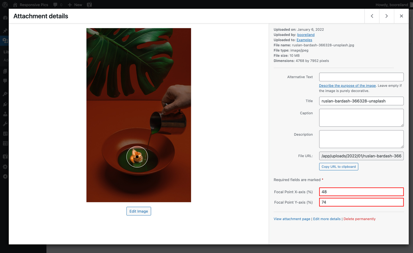
Attachment Details
When clicking on a thumbnail from the WordPress Media Library grid view, you will see the Attachment details modal. This will be the most accurate view to select your focal point:
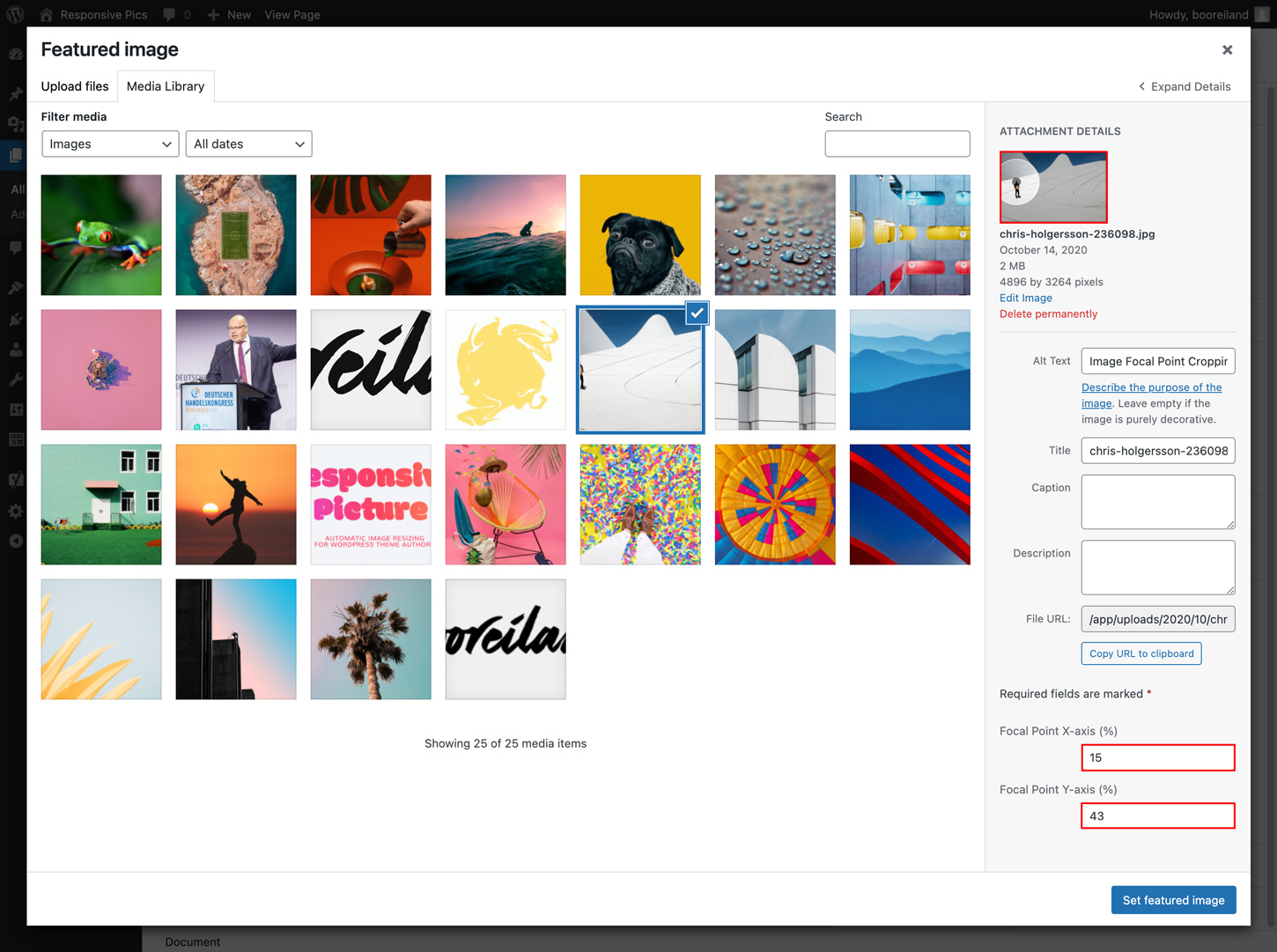
Featured Image
When setting or replacing an featured image in a page or post, you will see the Featured image modal. In this view you can select your focal point in the thumbnail at the top of the right sidebar:
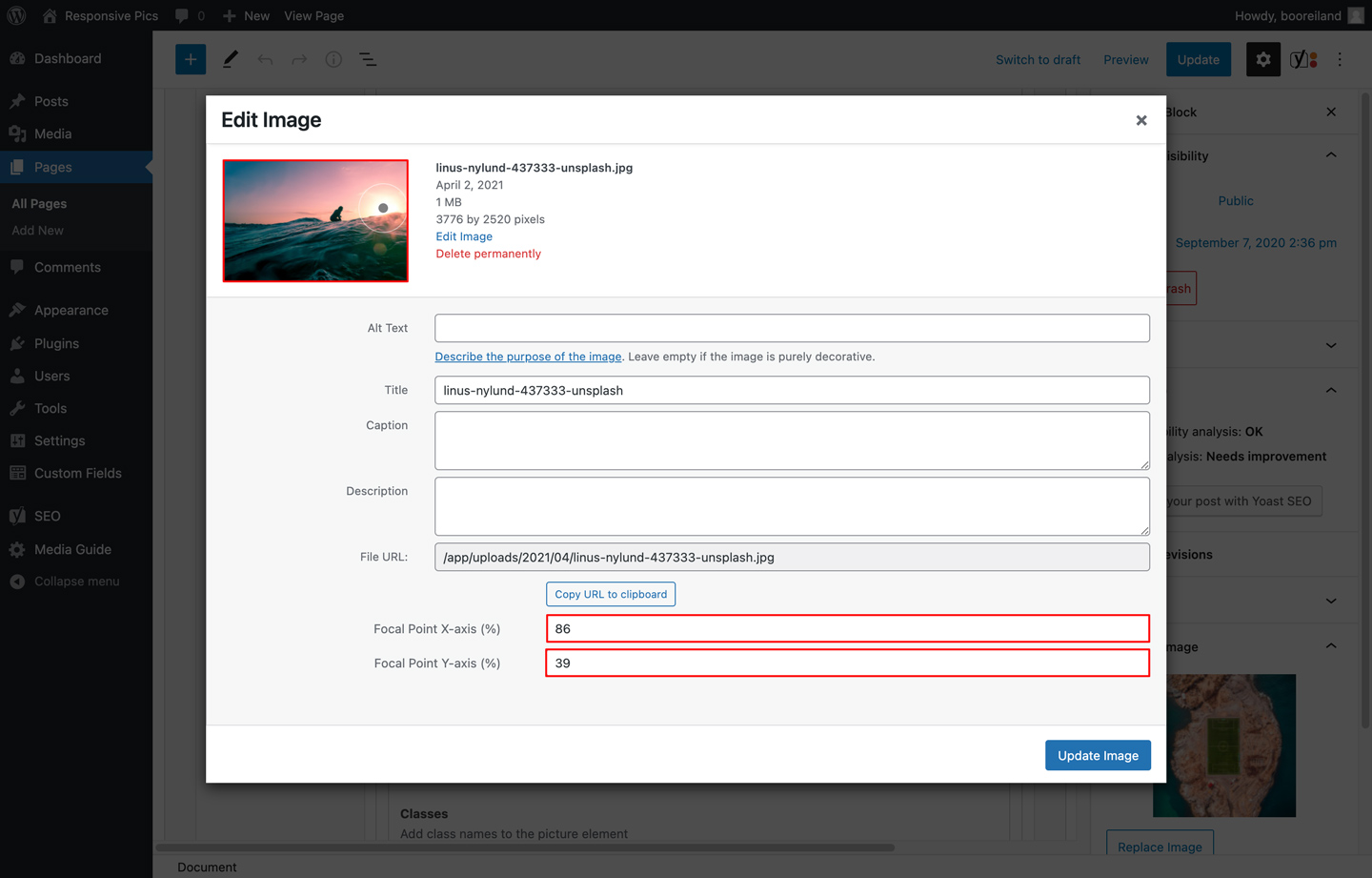
Edit Image
When uploading or editing an image in the WYSIWYG editor or meta field in a page or post, you will see the Edit image modal. In this view you can select your focal point in the thumbnail at the top left:
There are 3 ways you can set the focal point of an image with the interface:
- By directly clicking on the desired focal point in the image.
- By dragging and dropping the focal point circle element on the image.
- By entering the Focal Point X & Y-axis values as percentages directly in the attachment input fields.
By using one of these options a post meta key named responsive_pics_focal_point will be added or updated to the attachment with an array value containing the x & y coordinates as percentages:
[
  'x' => '86',
  'y' => '39'
]
To use this value elsewhere in your theme, you can retrieve it by calling:
$focal_point = get_post_meta($attachment_id, 'responsive_pics_focal_point', true);
- When visiting a front-end page and a
ResponsivePicsfunction call is made, this library will add the resize and/or crop image task as a job to the background process queue using Action Scheduler. - On every page load or on the next cron interval, Action Scheduler will run the next batch of jobs in the background process queue. See the Cron section for more information.
- When a job is up next in the queue and ready to be processed it will execute the resize and/or crop task and save the image in the same location as the original image when successful and it will remove the job from the queue.
- Once the image variation is created, it will skip the process of that variation on the next page load.
- When you change one of the image size parameters, it will automatically try and create the new image variation on the next page load.
- When the original image does not meet the dimension requirements of the requested image size, it will skip that image size variation and proceed to the next image size.
- Alt text will automatically be added on the picture img element if the original image in the media library has one.
- When deleting an attachment from the library, it will also delete all the resized images created by this plugin.
The background processing library Action Scheduler has a built in administration screen for monitoring, debugging and manually triggering scheduled image resize jobs. The administration interface is accesible via:
Tools > Scheduled Actions
Every resize job will be grouped by it’s wordpress image id.
When you are using the built-in WP-Cron, the background process queue will only process any tasks on every page load.
If you have disabled WP-Cron in your setup and you are using your own cron job on your server, Action Scheduler will use the interval set in that cron job to process the next batch of jobs.
define('DISABLE_WP_CRON', true);
If you’re using Trellis like us ❤️, the default cron interval is set to every 15 mins.
You could override this to for example 1 mins with an environment variable per wordpress site like this:
In for example trellis/group_vars/development/wordpress_sites.yml:
wordpress_sites:
  example.com:
    site_hosts:
      - canonical: example.test
        redirects:
          - www.example.test
    local_path: ../site # path targeting local Bedrock site directory (relative to Ansible root)
    admin_email: admin@example.test
    multisite:
      enabled: false
    ssl:
      enabled: false
      provider: self-signed
    cache:
      enabled: false
   cron_interval: '*/1'
Don’t forget to re-provision your server after changing this value.
If an error occurs during the resizing process or if there’s invalid syntax, ResponsivePics will display or return an error when WP_DEBUG_DISPLAY is enabled in your environment.
PHP
ResponsivePics errors
- breakpoint xxs is neither defined nor a number
REST API
{
  "code": "responsive_pics_invalid",
  "message": "breakpoint xxs is neither defined nor a number",
  "data": {
    "xs": 0,
    "sm": 576,
    "md": 768,
    "lg": 992,
    "xl": 1200,
    "xxl": 1400
  }
}
The following actions allow you to hook into the image resizing process timeline. You can place them in your theme’s functions.php file.
This action fires when ResponsivePics has scheduled a new image resize request to the ActionScheduler queue.
do_action('responsive_pics_request_scheduled', (int) $post_id, (array) $resize_request);
Parameters
-
$post_id
(integer) The attachment ID -
$resize_request
(array) The resize request parameters:
[
  'id'      => (int) The attachment ID,
  'quality' => (int) The requested image quality,
  'width'   => (int) The requested image width,
  'height'  => (int) The requested image height,
  'crop'    => (array) The requested image crop positions,
  'ratio'   => (float) The requested image ratio,
  'path'    => (string) The requested image file path
]
This action fires when the ActionScheduler has processed an image resize request in the queue.
do_action('responsive_pics_request_processed', (int) $post_id, (int) $quality, (int) $width, (int) $height, (array) $crop, (float) $ratio, (string) $resize_path);
Parameters
-
$post_id
(int) The attachment ID -
$quality
(int) The requested image quality -
$width
(int) The requested image width -
$height
(int) The requested image height -
$crop
(array) The requested image crop positions in percentages:
  [
    'x' => (int) The horizontal crop position as percentage,
    'y' => (int) The vertical crop position as percentage
  ]
-
$ratio
(float) The requested image ratio -
$resize_path
(string) The requested image file path
This action fires when ResponsivePics has successfully saved a resized image file locally.
do_action('responsive_pics_file_saved_local', (int) $post_id, (array) $file);
Parameters
-
$post_id
(int) The attachment ID -
$file
(array) The saved file containing:
  [
    'path'      => (string) The saved image filepath,
    'file'      => (string) The saved image filename,
    'width'     => (int) The saved image file width,
    'height'    => (int) The saved image file height,
    'mime-type' => (string) The saved image file mime-type,
    'filesize'  => (int) The saved image filesize
  ]
This action fires when WP Offload Media has uploaded the resized image file to your S3 storage.
do_action('responsive_pics_file_s3_uploaded', (int) $post_id, (array) $file);
Parameters
-
$post_id
(int) The attachment ID -
$file
(array) The S3 uploaded file containing:
  [
    'path'      => (string) The uploaded image filepath,
    'file'      => (string) The uploaded image filename,
    'width'     => (int) The uploaded image file width,
    'height'    => (int) The uploaded image file height,
    'mime-type' => (string) The uploaded image file mime-type,
    'filesize'  => (int) The uploaded image filesize
  ]
This action fires when ResponsivePics has successfully deleted a resized image file locally.
do_action('responsive_pics_file_deleted_local', (int) $post_id, (string) $file);
Parameters
-
$post_id
(int) The attachment ID -
$file
(string) The deleted image file path
This action fires when WP Offload Media has deleted a resized image file in your S3 storage.
do_action('responsive_pics_file_s3_deleted', (int) $post_id, (array) $file_paths);
Parameters
-
$post_id
(int) The attachment ID -
$file_paths
(array) The deleted resized file paths in your S3 storage.
When you installed and activated the WP Offload Media (Lite) plugin, this library automatically:
- Will offload any resized/cropped image generated by this plugin to your configured S3 storage provider.
- Will delete any resized/cropped image generated by this plugin in your configured S3 storage provider when deleting an attachment.
When enabling the lazyload option in the ResponsivePics::get_picture() or ResponsivePics::get_image() functions or API endpoints, this library automatically:
- adds a
lazyloadclass to the<img>element. - swaps the
srcsetwithdata-srcsetattributes on the picture<source>or the<img>elements.
This will enable you to use a lazy loading plugin such as Lazysizes or Lozad.
You can also set your own lazyload class by passing it to ResponsivePics library in your theme’s functions.php:
if (class_exists('ResponsivePics')) {
	ResponsivePics::setLazyLoadClass('lozad');
}
To install Lazysizes in your wordpress theme as a node module, run the following command from your theme directory:
npm
npm install --save lazysizes
Yarn
yarn add lazysizes
And import the package in your theme’s global javascript file:
import 'lazysizes';
When enabling the lqip option in the ResponsivePics::get_image() function or /responsive-pics/v1/get-image API endpoint, this library automatically:
- adds a
blur-upclass to the<img>element. - adds a fallback
srcattribute on the<img>element with a low quality placeholder image with a default width of100px.
This will enable you to style your placeholder image before the actual high quality image is loaded.
You can also set your own lqip class by passing it to ResponsivePics library in your theme’s functions.php:
if (class_exists('ResponsivePics')) {
	ResponsivePics::setLqipClass('blurred');
}
When enabling the intrinsic option in the ResponsivePics::get_picture() function or /responsive-pics/v1/get-picture API endpoint, this library automatically:
- adds a
intrinsicclass to the<picture>element and aintrinsic__itemclass to the picture<img>element. - adds
data-aspectratioattributes on the picture<source>and<img>elements with the calculated source image ratio.
This will enable you to pre-occupy the space needed for an image by calculating the height from the image width or the width from the height with an intrinsic plugin such as the lazysizes aspectratio extension.
To use the Lazysizes aspectratio extension in your wordpress theme, first install lazysizes as a node module as described in the Lazyloading section and import the extension in your theme’s global javascript file:
import 'lazysizes/plugins/aspectratio/ls.aspectratio.js';